The 2026 Christmas decor ideas below run from a single wooden riser on a kitchen counter to a full red-and-gold living room that reads as one continuous gesture from floor to ceiling.
Which one fits depends on whether you are dressing a surface you walk past or a room you live inside.
The beaded fruit wreath, the dusty blue chinoiserie tablescape, and the lighted ceramic village tray all share this: they solve a specific sightline or habit, not a generic holiday look.
[link-whisper-related-posts]1. Woodland Ornaments
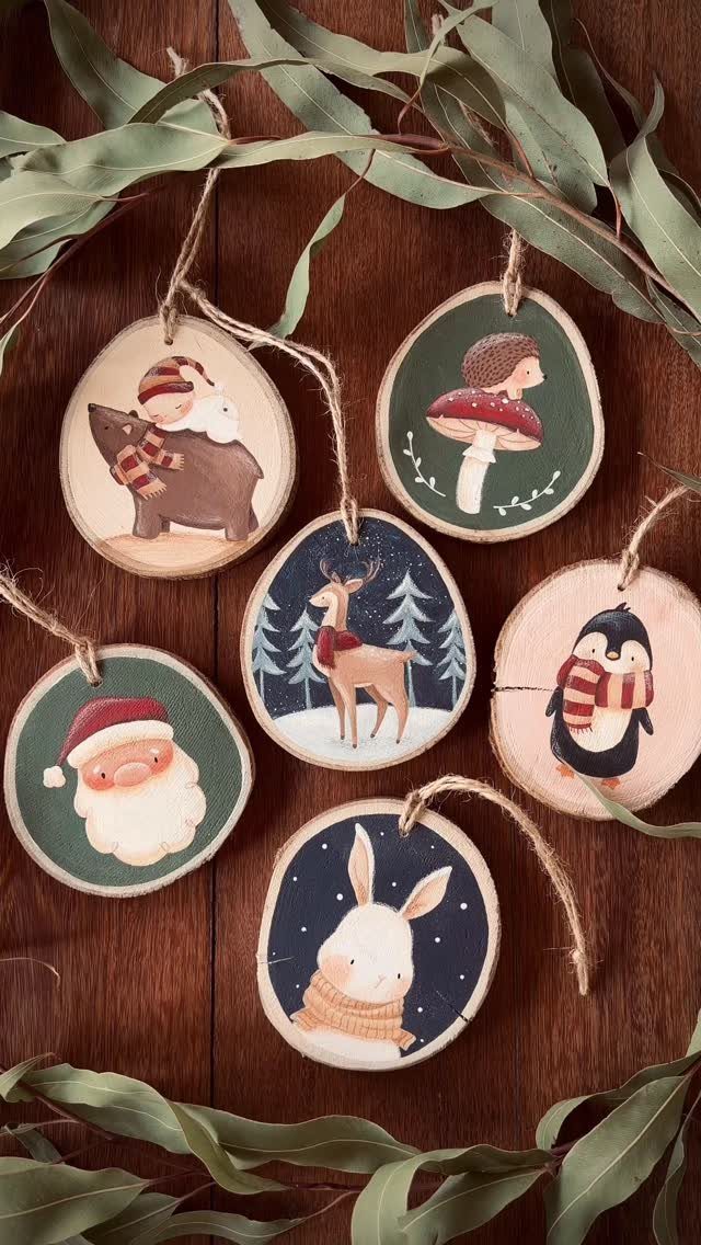
Hand-painted wood slices with twine hangers bring the forest inside without ever feeling rustic in a cheap way.
The bear, hedgehog, and deer motifs work because they keep the palette tight: chocolate browns, winter blues, and the natural tan of the wood itself.
Layer these with real greenery, pinecones, and maybe a strip of leather ribbon, and the tree stops looking themed and starts looking collected.
I would skip the penguin and Santa in a set like this; the woodland animals carry the story on their own.
Layering a few different garlands, pine and cedar and something with berries, costs less than buying enough of one kind to fill the whole surface and looks less flat.
The variation reads as depth, not clutter, and it costs less than matching everything.
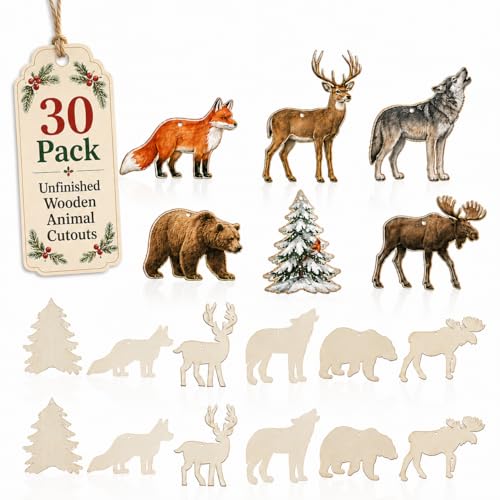
Package Includes: The package will provide you with 30 pieces of themed wood ornaments in 6 styles, and 5 pieces for each style. These wooden slices are rich in style and abundant in quantity, convenient for you to use or replace, and sufficient to meet your daily needs

Enchanting 3D Forest Animals Nestled in Acorns: Each forest animal acorn ornament captures foxes, owl, and squirrels tucked inside realistic acorn caps, instantly adding a whimsical woodland story to your Christmas tree or holiday display that draws everyone’s eye

Material: Wood. Size: Hats: Approx. 1x1.7 inch / 2.5x4 cm. Made of natural wood, laser cut and polished.
2. Nutcracker
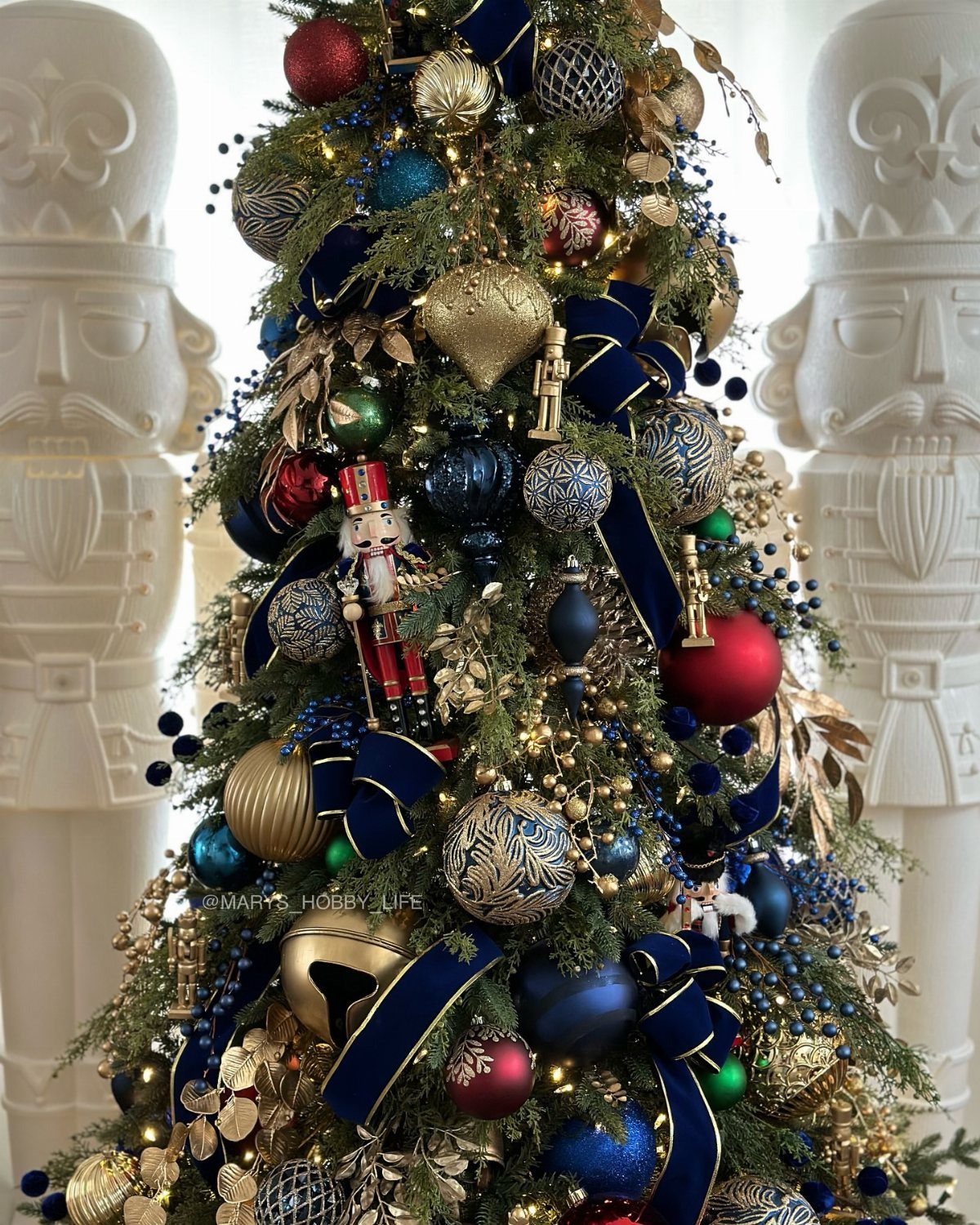
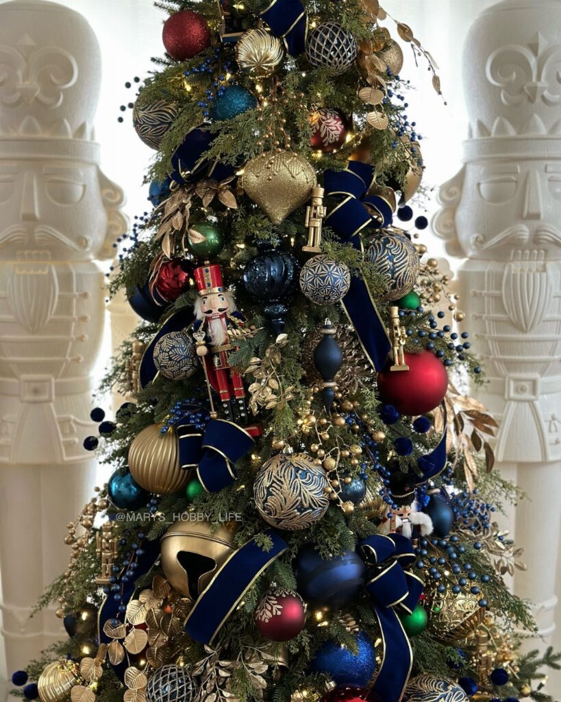
Royal blue against traditional red and gold is the change that makes this feel current rather than nostalgic.
The oversized white nutcracker figures flanking the tree read as architecture; smaller versions would read as detail. Together they keep the whimsy from tipping into childish.
Layered ribbon matters more here than in most themes because the colors are bold enough to fight each other.
Wide navy velvet, narrow gold, and a matte finish somewhere in the mix keeps the eye moving without chaos. Matte and metallic ornaments together create the depth that lets the blue sit forward instead of sinking back.
A nutcracker theme runs a little more than a single-color tree, but the result holds up through Christmas dinner with adults and still excites the kids on December 25th.

Handcrafted Fall Wreath: This Thanksgiving wreath features various berry skewers, pumpkins, pine cones and leaves with rich autumn elements and contrasting colors

SET OF 6 FESTIVE DESIGNS: Includes 6 Thanksgiving-themed ornaments featuring a turkey, pumpkin pie, cranberries, mashed potatoes, carrots, and a gravy boat.

Suitable Size: Measuring 12 inches in diameter, this wreath makes a stunning statement on any door. Its greatly balanced size ensures it stands out without overwhelming your entryway, creating a welcoming atmosphere for guests
3. Magnolia Leaves and Antique-Inspired Accents
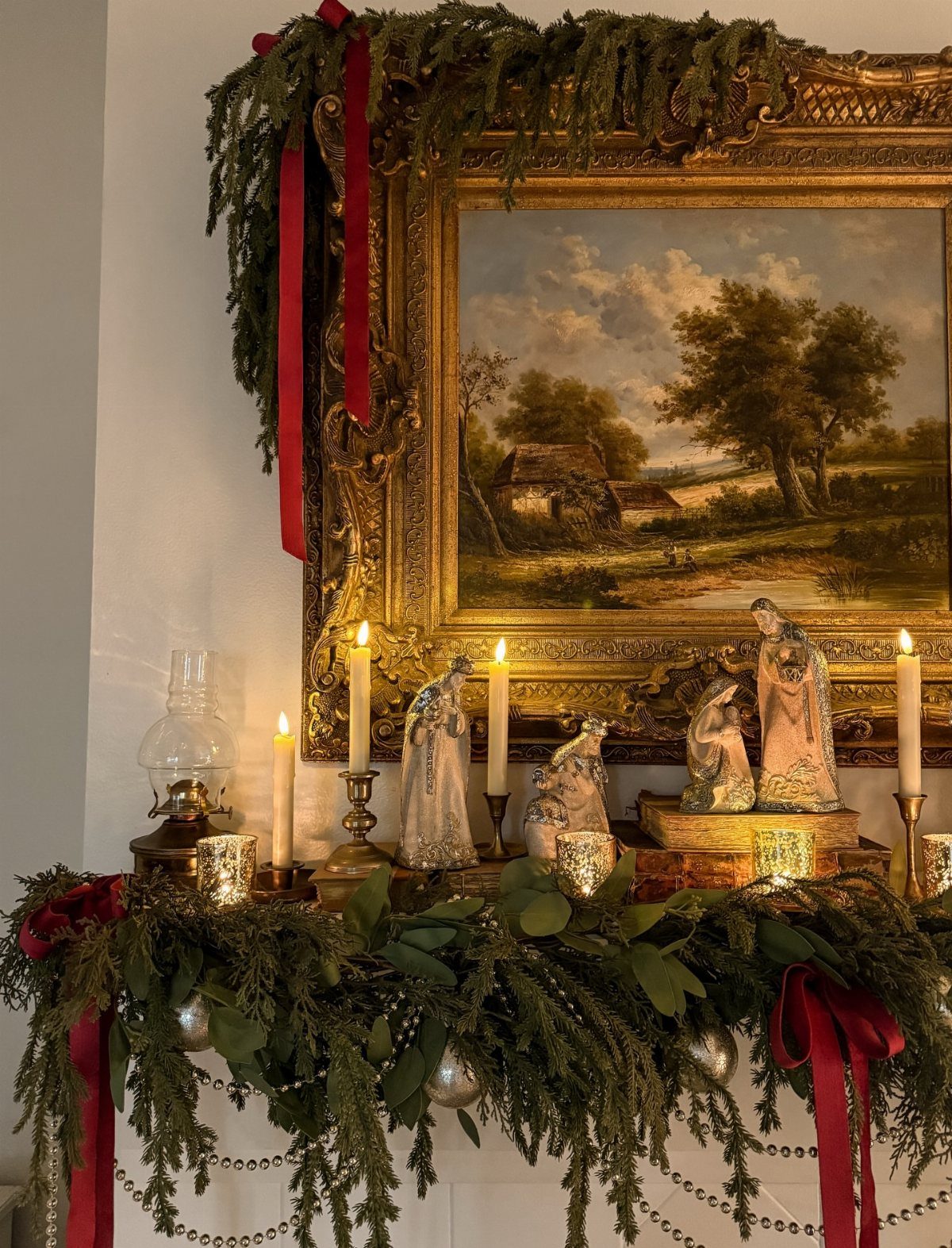
Deep burgundy and magnolia leaves on a mantel look like they have been there since the house was built, which is exactly what you want from this look.
The cedar and magnolia garland provides the base; the oil lamp, framed landscape, and metallic nativity are the accents that turn decoration into atmosphere.
Antique-inspired pieces need to look found, not bought as a set.
One ornate frame, one figurine with patina, one candlestick that has seen use. The magnolia leaves do the heavy lifting because their waxy texture catches light differently than standard pine, though they will brown as they dry.
I would start with the garland and build outward, leaving gaps. A mantel this full needs breathing room or it becomes a shelf in a shop.

Grandmillennial Blue and White Porcelain Theme: this set of 4 Christmas nutcrackers features an elegant blue and white design inspired by porcelain and pottery; Each figurine showcases intricate floral, scroll, and geometric patterns, blending traditional nutcracker charm with refined, timeless Eastern aesthetics for a unique decor statement

Large 4ft Nutcracker Display: Standing about 48 inches tall, this giant Christmas nutcracker creates a striking visual centerpiece for entryways, fireplaces, staircases, Christmas trees, and holiday displays that need extra height and festive presence

Package Contents: you will receive 6 pcs Christmas chinoiserie nutcracker centerpieces in 6 different styles; The nutcracker symbolizes justice, kindness and eternity, it can protect your room, make Christmas more cozy, bring good luck to your family, and promote your career, and bring endless wealth
4. Gingerbread Houses
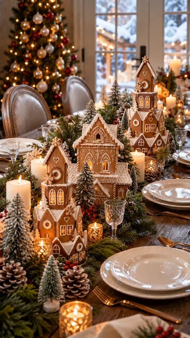
Lighted gingerbread houses as a dining table centerpiece solve the problem of a decoration that has to face 2 directions: toward the diners seated around it and toward anyone entering the room.
The soft creams and warm browns in this version keep it readable after dark, when colored icing would disappear into shadow.
Candy-inspired details work best when they are small enough to require leaning in.
Oversized icing bows on a tree draw the eye; on a house they would read as parody. The neutral palette here, champagne and pearl, lets the architecture stand in for color.
This is one theme where making your own is not required. Store houses with good proportions, lit from within, do the same work as baked ones and survive the season intact.

Realistic Magnolia Foliage Design: crafted with detailed veining and classic dark green tops with brown undersides, these faux magnolia leaves mimic the natural look of fresh foliage; Leaves may arrive compressed during shipping — simply fluff and reshape each stem by hand to restore full, natural volume; Brings timeless Southern charm to your home, wedding, or seasonal display
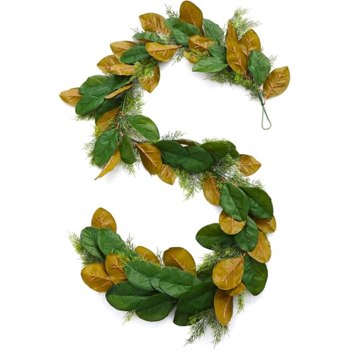
Realistic Magnolia Garland: you will get 1 piece of Christmas magnolia garland with cedar, which is 6 feet long, suitable length, the magnolia artificial leaves and cedar branches touch is very real, this realistic leaves add a natural and elegant touch to your holiday and wedding decor

Christmas Cedar Garlands: Package including 1 pcs 9 FT Artificial Cedar Garland with ultra-dense full foliage, crafted with finely detailed realistic cedar needles. Delivers true-to-life evergreen texture to fill your space with warm natural winter & Christmas festive atmosphere.
5. Crystal-Inspired Ornaments
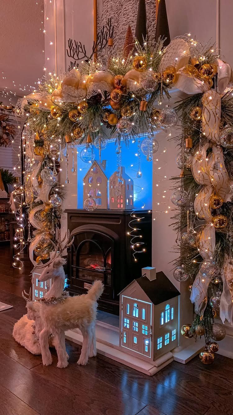
Crystal-inspired ornaments need restraint to avoid reading as a hotel lobby.
The clear glass and delicate metallic finishes here work because they are set against evergreen and gold ribbon, not more crystal. Fairy lights behind and through the pieces create the refraction that makes them feel alive.
Limit the palette to 3 colors, then make the interest come from texture, glass against wood against velvet, rather than from adding more hues.
A restrained palette forces attention onto shape and light, which is where this look earns its keep. The ceramic house lanterns on the floor ground the scene and keep it from floating away entirely.
This suits a mantel or a tree in a room that already has some formality, a dining room or a front parlor.
In a space with too much soft furniture it can feel cold; in a space with hard surfaces it warms them.

3 Biblical Style Herodian Olive Oil Lamp

【Black Lamp Head Oil Lamps】Kerosene lamp is composed of a windproof clear glass chimney, a glass lamp holder and a black metal flame regulator, which is vintage and beautiful, suitable for tabletop decoration, light up your home decor.
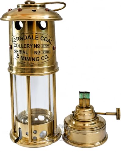
Full Working Oil burner is good condition and produce clear light through. Solid glass Fresnel type lens / Look Photos Is Actual Image Of Product. All Work is Hand Made Good Piece of Collection office Decorative Home Decorative Best Product For Birthday Gift Anniversary Gift Christmas Gift ETC
6. Beaded Fruit
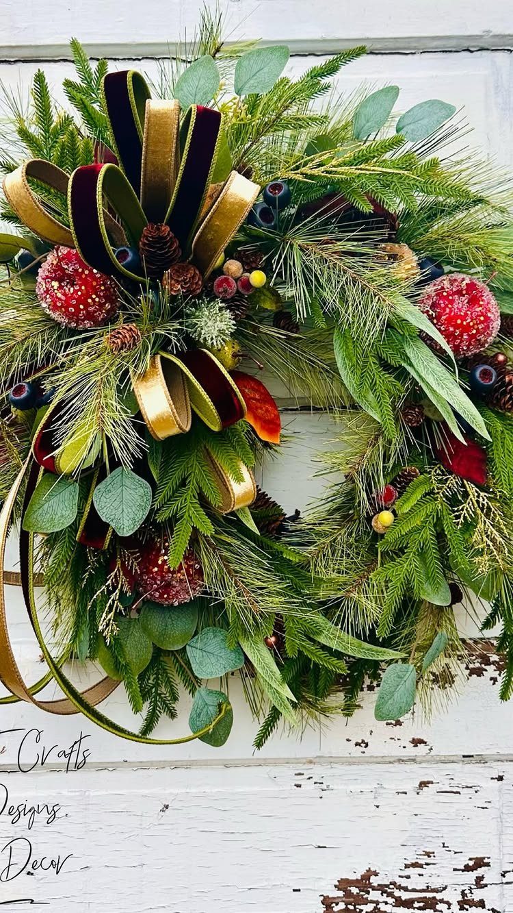
Beaded fruit on a wreath is the kind of detail that rewards the person who walks up to the door instead of rushing past.
The red apples here are not realistic; they are better than realistic, because they read as fruit from a distance and as craft up close.
Layer them with real greenery and the eye keeps moving between what is fake and what is not.
Jewel tones and brushed gold play against the red without competing. I prefer the mixed approach, realistic fruit plus beaded, though a wreath of only beaded fruit with deep burgundy and antique gold has its own logic.
A door in full sun will fade real fruit fast; the beaded version holds color and shape through weather that would turn a real apple to mush.
Hang it with a ribbon that can handle rain, or plan to bring it in during storms.

Enchanting Forest Animal Collection: unleash the charm of the wilderness with this set of 36 rustic Christmas tree ornaments; Each package includes enough woodland Christmas ornaments for all your decorating needs, suitable for Christmas or other festive occasions; Share the joy with friends and family with this plentiful supply of forest animal hanging ornaments

Wooden Animal Cutouts: this set includes 54 pieces of wooden animal shape cutouts in 18 unique designs, with 3 pieces per design, with the longest side measuring up to 10 cm/3.94 inches, the collection covers three popular themes-dinosaurs, ocean sea life, and forest animals, offering a diverse assortment and an abundant quantity, it easily meets your daily DIY crafting and decorative needs

💎【What You Received】: 24 pieces of unfinished wood cutouts in 8 different woodland forest creatures designs, 3 pieces for each style, which make your art works more diverse. A sufficient number of jungle themed wood ornaments with different sizes and shapes can meet the needs of DIY crafts
7. Traditional Plaid Holiday Tablescape
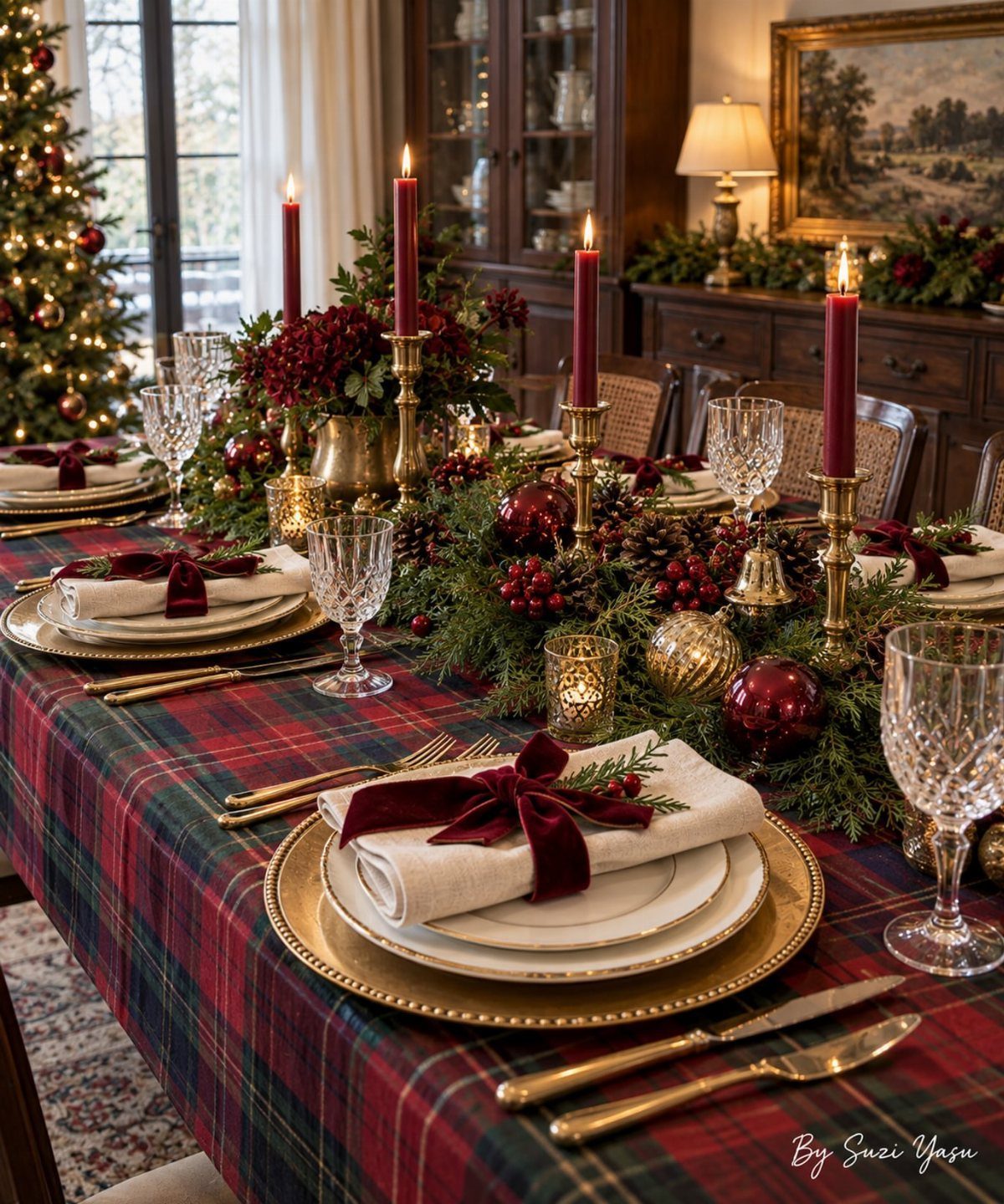
A plaid tablecloth this saturated in red and forest green needs gold to keep it from reading as a picnic. Brass candlesticks and chargers keep a plaid tablescape from flattening into something purely rustic.
The Ralph Lauren take on this, black watch plaid with navy and midnight green, runs sharper and costs more.
I would stay with the classic red and green if the room already has warm wood or a fireplace, and save the black watch for a space with leather or darker walls.
Real greenery down the center, not a florist arrangement, keeps the formality from tipping into stiffness. Cedar holds up longer than pine on a table where people lean in to pass dishes.

Red and pink wood bead wreath: This delicate wall-mounted wood bead hoop garland with faux silk flower and green leaf accents looks lifelike and very elegant. Perfect for decorating any space in your wedding party and room.

Wall wreath:you can put it anywhere in your home as a decoration, or a party decor whether indoor or outdoor, you can use it to decorate,beaded floral wreath front door

Construction: Crafted from plastic and iron, this Emulation Olive Fruit Wood Beads Wreath ensures durability and a realistic appearance, making it a perfect addition to your home decor
8. Blue and White Chinoiserie Tablescape
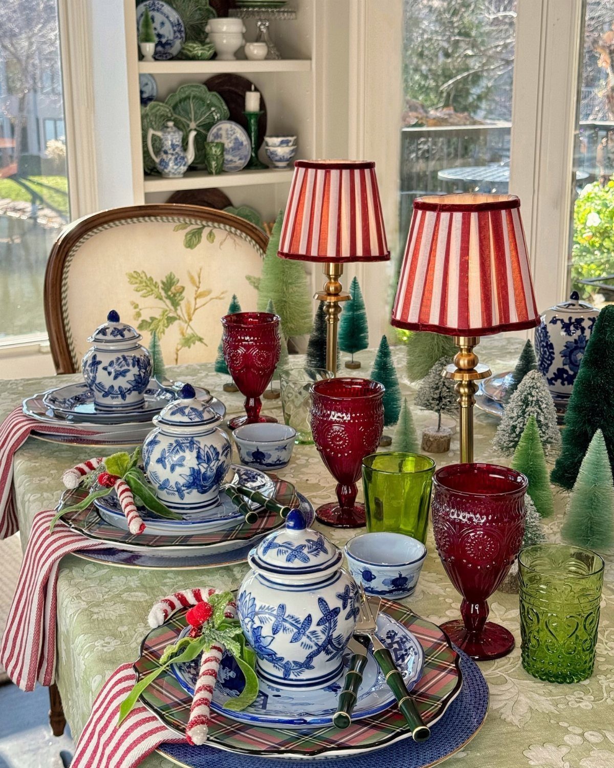
Blue and white porcelain on a Christmas table is not new, but the dusty blue ribbon and beaded blueberries in the 2026 versions pull it away from looking like year-round china pressed into holiday service.
The red goblets and striped lampshades visible here do the same work: they announce this is December, not a dinner party that happened to fall in winter.
Ginger jars work best as accents tucked among the place settings, not as the main event.
Miniature bottle brush trees in the same dusty blue, not the brighter shades, tie the porcelain to the rest of the table without matching too neatly.
I would skip this if the dining room has no natural light; the blue can turn cold under yellow bulbs alone.

Layered Display: this set includes 2 wooden nutcrackers measuring 9.84 and 7.87 inches tall, creating a balanced height variation that adds dimension and a refined focal point to Christmas mantels, shelves, and table displays

Blue & White Porcelain Design: Elevate your Christmas decor with our nutcracker yard signs that seamlessly blend classic holiday charm with timeless Chinese blue and white porcelain aesthetics. mimicking the delicate texture and elegant motifs of traditional porcelain pieces. Crafted with attention to authenticity, these signs bring a fresh, refined perspective to Christmas yard decorations

Elegant Design: this 15-inch nutcracker features a classic soldier design, great for enhancing your holiday decor, the classic soldier nutcracker figure is a great choice for celebrating the upcoming Christmas season
9. Lighted Ceramic Village Tray
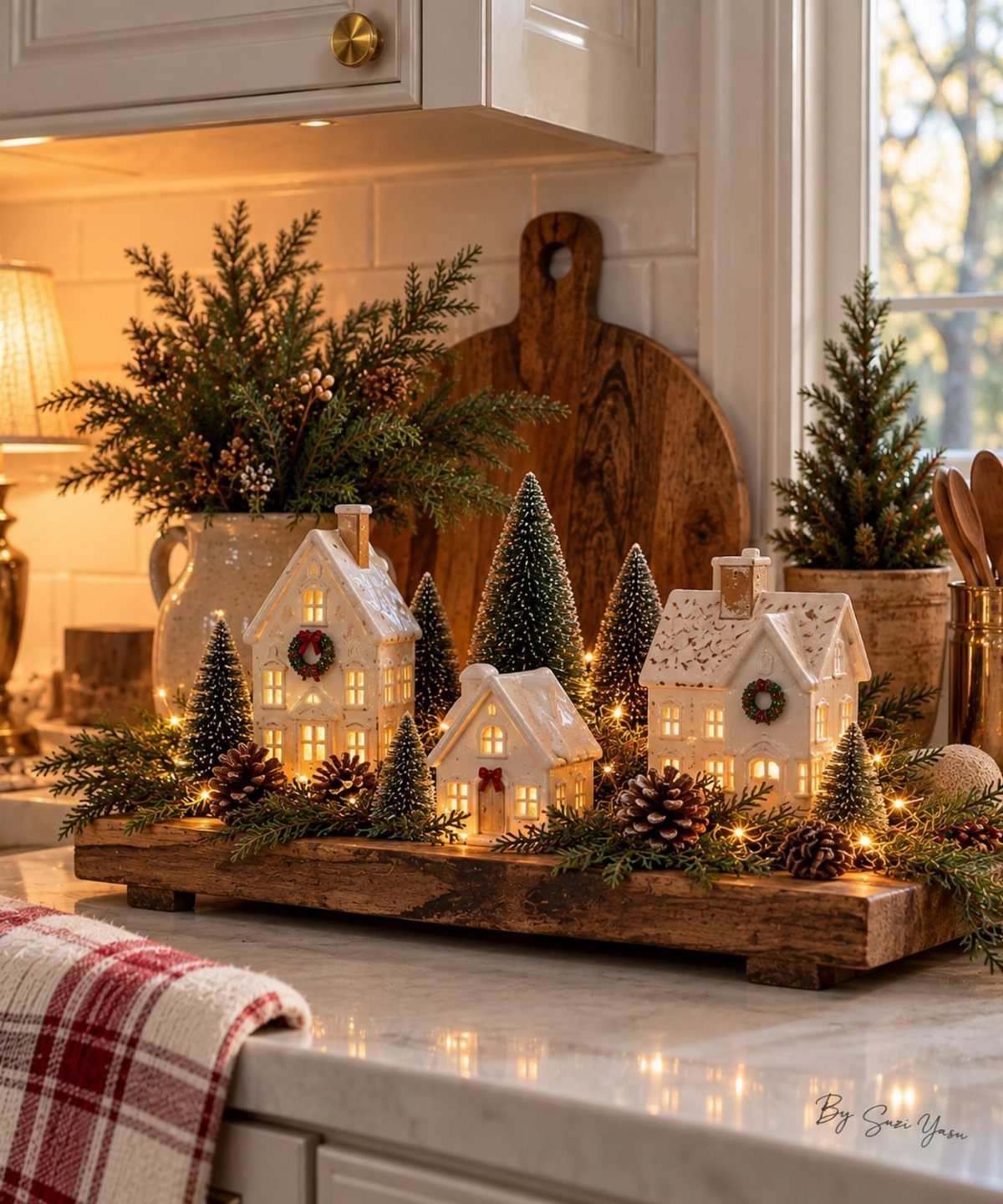
3 houses on a wooden riser, lit from within, with bottle brush trees and scattered pine: this is the smallest footprint of any village display I have seen work.
The marble counter underneath reflects the light upward, which doubles the glow without adding more wattage.
Check that the tray edges are high enough to catch a pinecone before it rolls onto the stove. The fairy lights visible here are the warm white kind, not color-shifting; the ceramic already has enough variation in glaze tone.
A kitchen counter is an unusual spot for a village, but it solves the problem of where to put something seasonal that still needs to face the room. The houses stay cool enough to sit near fruit or bread.

6Ft Fall Garland: each package includes 1 pieces brown magnolia leaf garlands; This brown magnolia leaf garland is suitable for outdoor decor on porches, patios, or entryways all year round; Its robust design ensures lasting beauty, making it a reliable choice for your home's exterior decorations

【Realistic Cedar garlands】: Unlike ordinary garlands, these three-dimensional cedar garlands are meticulously crafted to create a lush, three-dimensional visual effect. They perfectly replicate the natural grain and full form of real cedar

Realistic Artificial Brown Magnolia Leaf Garland: Autumn‑themed garland features lifelike brown magnolia leaves paired with bright orange berries. Adds warm rustic fall flair to your home seasonal decor.
10. Classic Red and Gold Living Room
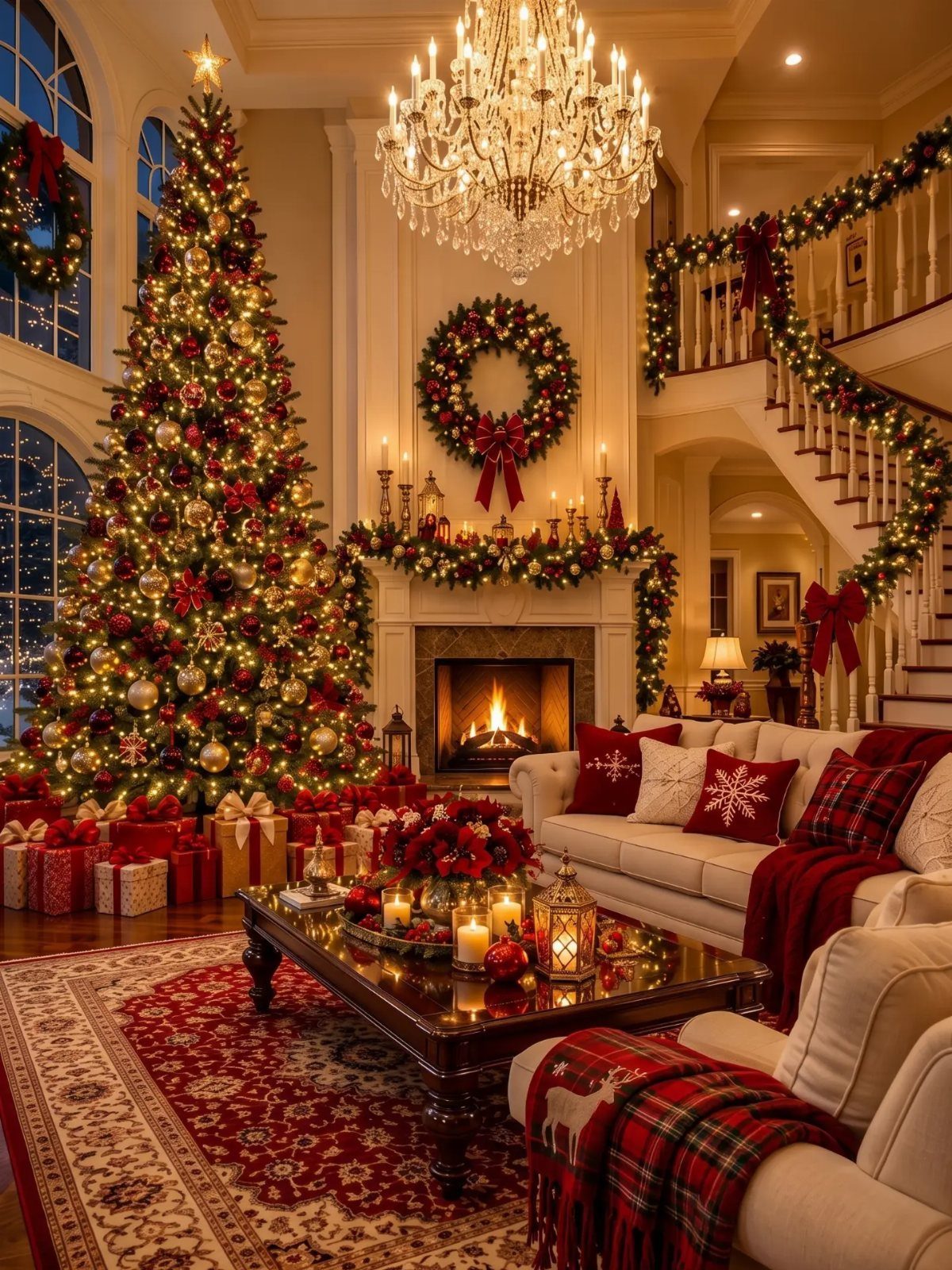
Red and gold never left, but the 2026 version layers deeper into the branches before the edges get touched.
The tree in this room shows it: ornaments sit at 3 depths, not hung on the surface like earrings. The garland on the staircase carries the same density, so the eye reads one continuous gesture from floor to ceiling.
Ivory or cream in the upholstery, visible here on the sofas, keeps the red from becoming overwhelming in a room this size. Without that neutral ground, the gold would read as brassy and the red as loud.
This suits the person who hosts every year and wants the room to look finished by December 1st, not still in progress on the 23rd. The upfront time pays back in not having to rethink anything mid-season.

OIL LANTERN - This antique oil lamp is easy to fuel using lamp oil or kerosene (not included) to provide light without electricity, whether you want to enjoy charming ambient light or ensure that you have emergency lighting during a power outage.

kerosene lamp design:This vintage desk lamp is mainly due to its "kerosene lamp" design. Matte black antique iron products paired with patterned glass, the glass is quite thick, both the aesthetics and craftsmanship are on point.

【Oil Lamp Set of 2】You will receive 2 pieces chamber oil lamp, each lamp is composed of a windproof glass chimney, a glass lamp holder and a metal flame regulator, which is vintage and beautiful, suitable for tabletop decoration, light up your home decoration; Warm note: the lamp oil is not included.
Layering Textures and Colors
Texture does more work than color once the palette narrows to a few tones.
The 2026 champagne and aqua pairing from Decorators Warehouse relies on exactly this: crystal, metallic ribbon, and soft florals all read as related because the colors stay quiet, but the surfaces catch light differently from every angle.
A restrained palette fails when everything shares the same finish. Mixing matte velvet against shimmering glass and delicate metal keeps the eye moving without adding a fourth or fifth color.
The designer note there is to vary texture instead of hue, and it holds up because too many competing colors read as clutter from across the room.
I would add that this applies beyond the tree.
A mantel or tablescape built from the same few tones needs the same discipline: one rough element, one smooth, one that catches light. Without that contrast, even champagne and aqua flatten into something closer to beige.
Personalization in Decor
No single theme claims to be the right one; each solves a different room, budget, or memory.
What makes a decoration matter is whether you would notice its absence. The lighted village on a kitchen counter greets someone making coffee at six in the morning.
Personal style is not a matter of finding your one true aesthetic. The gingerbread houses work whether you bake them or buy them.
The magnolia leaves look collected whether they came from your yard or a craft store. What reads as personal is the choice to start with something that means something, not the provenance.
Nostalgic Elements
Nostalgia in decoration is not the same as reproduction. The Heritage Holiday collection leans on deep burgundy, forest green, and antique gold, but its warmth comes from how the pieces appear arrived-at rather than purchased as a set.
Magnolia leaves are the specific detail that carries this. Their waxy surface catches light differently than standard evergreen, though they brown as they dry, which means they read as aged rather than fresh-cut and temporary.
That quality, the suggestion they have been there before and will be again, is what separates nostalgic from merely old.
A scuffed oil lamp, a framed print with foxed edges, a candlestick worn soft at the grip: accents that carry their own years do the work of making a room feel lived in, not staged. One ornate piece does this.
A matched set of three from the same catalog undoes it. The gap between collected and bought-all-at-once is where the warmth lives.
Color Palettes for 2026
The 2026 palettes that show up in new collections fall into two groups. Sage green and pearl, from the Sage & Pearl collection, runs quiet and botanical.
Dusty blue, visible in the chinoiserie tablescape and the nutcracker theme, reads slightly more formal. Both avoid the bright primaries that dominated retail a decade ago.
The shift is toward colors that look like they have been muted by distance or time.
What separates a palette that dates itself from one that lasts is restraint in hue and variety in texture. The same sage green with only satin ribbon and smooth ceramic reads flat.
Add frosted greenery, pearl finish, and ribbon with body, and the single color carries the whole tree. The 2026 direction is not toward more colors but toward more sophisticated use of fewer ones.
Frequently Asked Questions
What is the Christmas decor trend for 2026?
The main directions are Winter Woodland, Nutcracker, and Heritage Holiday.
Woodland uses hand-painted animal ornaments in chocolate brown and winter blue against real greenery. Royal blue shows up everywhere this season, paired with the usual red and gold so the overall effect feels fresh instead of like a rerun.
What is the Christmas color of 2026?
Sage green and pearl, dusty blue, and rich jewel tones are the colors showing up in new collections. Colors are drifting toward ones that seem faded by sun or age, not the straight-from-the-tube brights that dominated a few years back.
Dusty blue appears in ribbon, beaded blueberries, and miniature bottle brush trees; sage green runs quiet and botanical when paired with frosted greenery and pearl finishes.