The best house colors exterior for 2026 range from warm whites that sell later to deep greens that replace black, and the deciding factor is what you cannot repaint: your roof, stone, and brick.
A white in the 80–85 LRV range bounces light without blinding the neighbors, but push toward 90 and your aged pavers will look dirty by comparison. That garage repaint with Chantilly Lace taught me the hard way.
[link-whisper-related-posts]1. White and Off-White
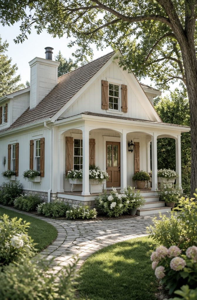
White still owns the top spot for exteriors, and the numbers back it: 23% of homeowners renovating their outside walls choose it, more than gray at 19% or beige at 10%.
The reason is practical as much as pretty. Light colors reflect heat, make a small house read larger, and give you the widest margin for error with trim and door colors.
A white that survives real daylight is the one worth picking.
Benjamin Moore White Dove OC-17 carries just enough warmth to keep from going sterile at noon, while Sherwin-Williams Dover White leans creamier and calmer, especially suited to cottage-style cladding where you want coziness rather than crispness.
Valspar’s Ultra White 7006-24 and Swiss Coffee 7002-16 sit on opposite ends of that same warm-to-clean spectrum.
LRV, or Light Reflectance Value, is what separates the livable ones from the mistakes.
A white in the 80–85 range bounces plenty of light without blinding the neighbors; push toward 90 and above, and you risk a glare that makes your roofline and fixed stonework look dirty by comparison.
I learned this the hard way on a garage repaint where Chantilly Lace against aged concrete pavers read as hospital-grade, not heritage. The pavers had not changed; the white had simply outshone everything around it.
Maintenance is the other reality. White shows pollen, mildew, and road grit faster than any neutral.
Budget for pressure washing at least once a season, and know that north-facing walls will need earlier attention. Longevity is the real win: unlike trend colors that date themselves in five years, a well-chosen white sells the house later.

CONVENIENT SIZE - FolkArt Outdoor Acrylic Paint comes in convenient 2 oz bottles of outdoor craft paint - perfect for painting flower pots, birdhouses, mailboxes, patio décor, and so much more

Kilz 1682863 1 gal Oil & Water-Based Siding Fence & Barn Paint Exterior White - Pack of 4

Ultra Premium Paint and Primer In One
2. Gray and Greige
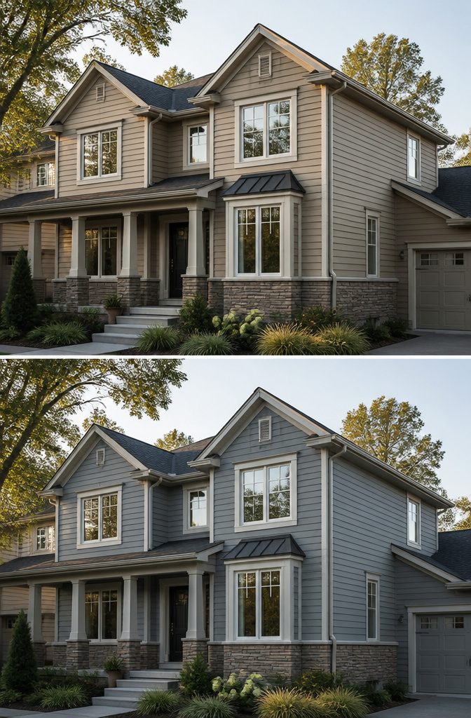
True gray sits right in the middle, no warm drift and no cool cast. Greige pulls toward taupe or beige, and that warmth changes everything once it hits siding scale.
Revere Pewter HC-172 and Agreeable Gray both read as neutrals on a chip, yet Revere Pewter carries a greener, cooler base while Agreeable Gray leans unmistakably warm.
The wrong undertone against a roof with red-brown flecks or stonework with golden calcium deposits turns the whole house muddy or pink.
A sample board in morning light can look entirely different by four o’clock. Colors shift under cloud cover, and a gray that seemed crisp may suddenly flash lavender or sage against brick.
The fixed elements, roof and stone especially, hold undertones of their own. Pull from those rather than fighting them.
I once brushed out a sample of what I thought was a clean mid-gray and propped it against our porch stonework.
By afternoon the warm undertone I had ignored pushed the sample almost beige, clashing hard with the cool cast in the limestone.
The chip alone had hidden it completely. Now I test against the actual roofline and let the board sit for two full days of light before I decide.
GREAT FOR HIGHLY POROUS SURFACES: Brightens the appearance of stucco, stone, brick and wood while letting natural surface texture shine through

MADE FOR EXTERIOR MASONRY: Designed for concrete, cement, brick, stone, stucco and masonry walls. Ideal for refreshing exterior walls, facades, garden walls and other properly prepared vertical masonry surfaces.

3. Earthy Greens
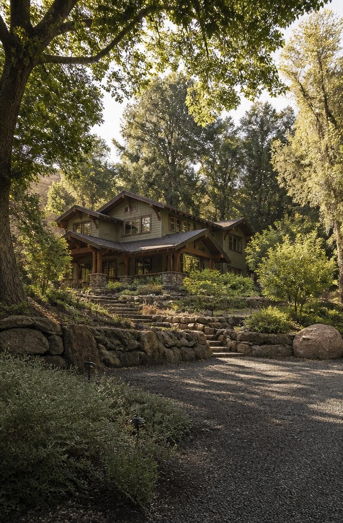
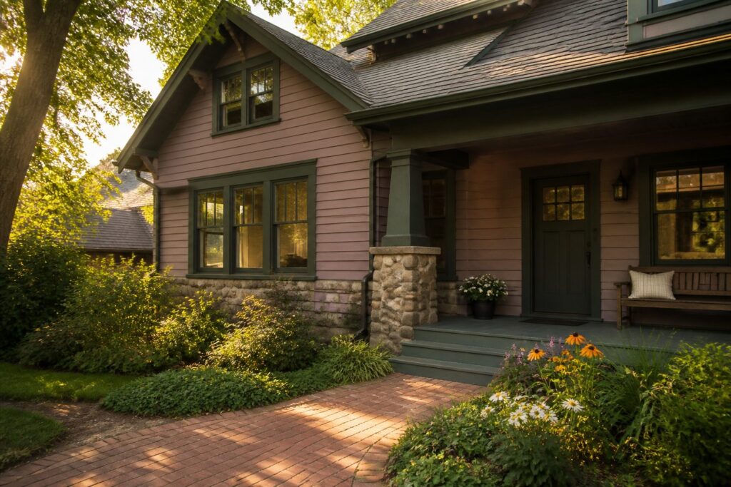
Green has found its footing outside again, and this time it is not the kelly or mint of decades past. The shades worth watching are olive, sage, and the deeper greens that read almost as brown in late light.
Benjamin Moore’s Mohegan Sage carries enough gray to settle against wood and stone without shouting, while Regent Green goes darker and richer, the kind of color designer Baker Speight might pair with white trim rather than surrender the whole house to it.
Sherwin-Williams offers Muddled Basil in the same family, a deep brown-green that one designer is using on her own build as a swap for black siding.
The architectural match matters more here than with neutrals. These greens suit modern cabins and Craftsman homes especially well; Victorians can carry them too, but the trim color becomes the decision that makes or breaks the look.
What surrounds the house pulls the color in or pushes it toward costume.
Stone foundations, wood decks, and mature landscaping absorb these greens naturally. A bare lot or bright concrete driveway leaves the same color looking dropped from above.
The common mistake with greens is sampling too small.
A 2-inch swatch on one clapboard tells you almost nothing. These colors shift dramatically across a whole wall as the light changes, and olive that reads sophisticated at 8 a.m. can turn military by noon.
Paint a section at least 3–4 feet square and live with it for a full day before deciding.

Ready to use, pre-mixed door and trim paint offers a fresh new look on interior or exterior metal, wood and fiberglass

Latex‐Base Mould & Mildew‐Proof Waterproofing Paint
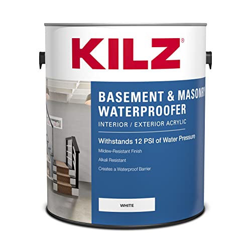
Waterproofing Protection with Nanotechnology: Engineered with advanced nanotechnology to create a powerful water barrier—KILZ waterproofing paint blocks up to 12 PSI of water pressure to help stop water infiltration on concrete and masonry surfaces.
4. Deep Blues and Charcoals
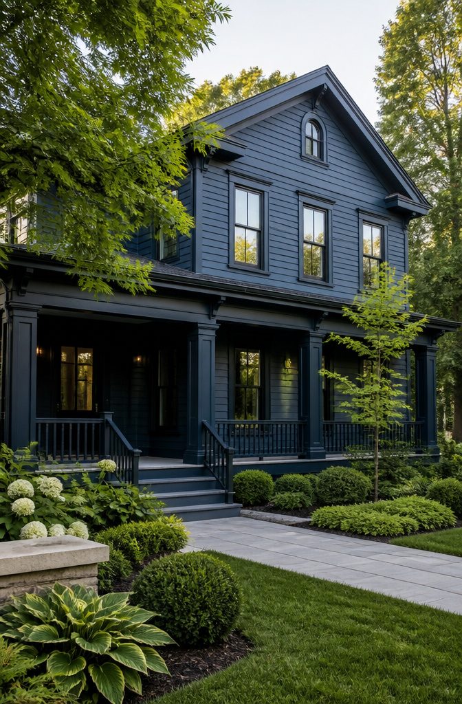
Navy and charcoal sit at the edge of what most homeowners will risk, and that tension is exactly why they work.
Benjamin Moore’s Nightfall reads as near-black in late afternoon shadow but softens to a true, deep navy when morning light hits it straight on.
That shift is the selling point, not a flaw; the color earns its keep by looking intentional at every hour.
Charcoal shades like Sherwin-Williams Gauntlet Gray or Andiron carry the same duality with less blue in the mix.
They pair naturally with wood grain, stone veneer, or warm white trim, which keeps the exterior from flattening into a single dark plane. Without lighter trim or natural material contrast, a moody body color goes heavy fast.
The practical limit is south-facing walls. Dark pigments absorb heat faster than mid-tone alternatives, and that thermal load stresses siding and paint film over years, not decades.
On a two-story facade with strong southern exposure, the safer play is charcoal or navy on the north and east elevations where light stays indirect, with a lighter body color where afternoon sun concentrates.
For a single-story ranch or a wall broken up by generous porch shadow, the risk drops enough to go uniform.
These colors demand a sample board left up for a full day. What reads sophisticated at 9 a.m. can turn oppressive by 5 p.m., and the only way to know is to watch it happen on your own siding.

Flows on smoothly and dries to a tough, durable finish

All Match Paint: Our All Match Paint kit is Paint+Primer in one, no sanding, no priming, no top coat needed
【Multi-Purpose Water-Based Paint】: Vigorder white touch up paint requires no sanding, primer, or multiple coats—achieve a perfect finish in just one step. Easily refresh furniture, door frames, and other painted surfaces
5. Burgundy and Deep Reds
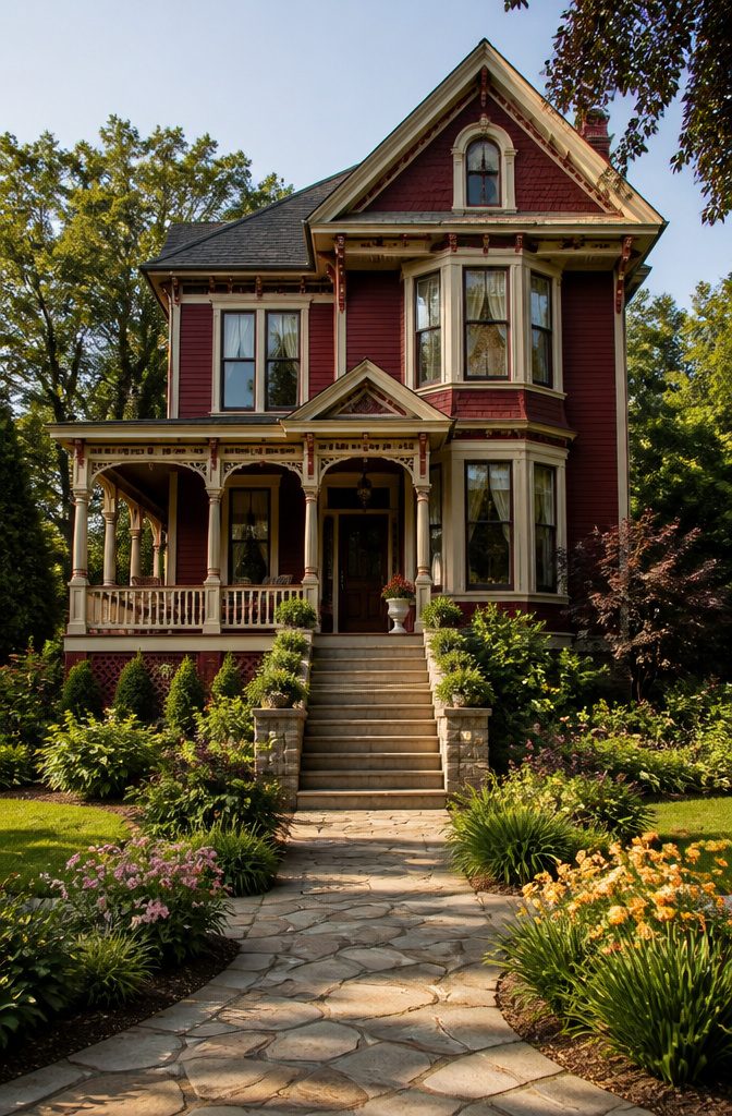
Burgundy and deep reds demand more courage than most exterior choices, but the return is a house that actually registers from the street instead of fading into the row.
The risk is real: done flat and heavy, the effect reads barn or institutional, not refined. What saves it is architecture with natural breaks.
A Victorian with ornate trim, a Craftsman with thick corner boards, or any facade with a covered porch gives the eye somewhere to rest. Smooth ranch boxes and plain colonials struggle; the color has nowhere to go.
Regional tolerance varies more than with neutrals.
In New England and parts of the Midwest, deep red has enough history that neighbors barely blink. In the Sun Belt or newer subdivisions, the same shade can feel like a statement you did not mean to make.
Drive your block at dusk, when paint reads most honest, and check whether any house within sight already carries a saturated color. One red house is character; two starts a conversation you may not want to join.
Trim is the make-or-break detail. White against burgundy defaults to barn logic fast.
Cream softens the edge without going stark. Deep forest green or even black trim, used sparingly on sashes and gutters, pulls the whole thing toward something intentional.
I have seen charcoal work beautifully on a 1920s foursquare and look like a mistake on a 1990s split-level; the difference was the trim weight, not the red itself.
Coverage costs run higher than the can suggests. Reds in the burgundy range carry less titanium dioxide, so plan on a third coat or a tinted primer to kill the old color underneath.
That extra gallon or two turns a $300 weekend into a $450 one, and skipping it leaves a patchy, brownish undertone that shows every time the clouds move.

MADE FOR EXTERIOR MASONRY: Designed for concrete, cement, brick, stone, stucco and masonry walls. Ideal for refreshing exterior walls, facades, garden walls and other properly prepared vertical masonry surfaces.

GREAT FOR HIGHLY POROUS SURFACES: Brightens the appearance of stucco, stone, brick and wood while letting natural surface texture shine through

Ready to use, pre-mixed door and trim paint offers a fresh new look on interior or exterior metal, wood and fiberglass
6. Warm Neutrals
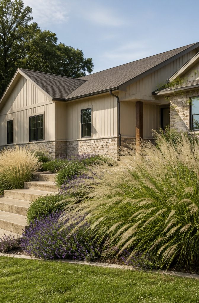
Warm neutrals sit in the middle of the road on purpose. Beige, taupe, and their cousins add the softness that crisp white or cool gray withhold, and they do it without announcing themselves to the neighbors.
The fixed elements on your house decide whether these shades work; your roof, brick, and stone carry undertones that a warm neutral either flatters or fights.
Gray trends age toward the dated side faster than their fans expected, partly because cool tones show dirt and wear more openly and partly because the eye now reads them as the default of the last decade.
Warm neutrals carry a longer shelf life because they borrow from materials that already exist on the property.
Benjamin Moore Grant Beige and Sherwin-Williams Agreeable Gray are the usual recommendations when someone wants that middle ground: neutral enough to resell, warm enough to feel like home.
The common mistake is choosing a beige with too much yellow in it against brick or stone. Stone especially carries its own temperature, and a yellow-beige parked next to gray-flecked stonework turns sour in afternoon light.
The flecks in your stonework are the better guide; pull from them instead of imposing a warmth the material does not share.

Zinsser 02704 Quart Satin Gloss Perma-White Mildew-Proof Bathroom Paint

This high-quality, acrylic latex water-base interior/exterior paint offers excellent hiding properties with great adhesion and water repellency on textured interior and exterior surfaces
7. Bright Colors
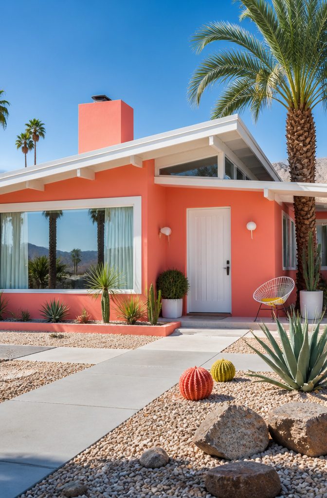
Bright colors on a house exterior split the room before the first brushstroke dries. Coral reads as playful in a Palm Springs desert setting, where midcentury history makes flamboyance feel expected rather than forced.
Yellow with crisp white trim carries that same energy into more traditional neighborhoods, though gray or brown roofing usually anchors it enough to keep the house from looking like a rental cottage.
Turquoise paired with white projects youthfulness, but the geographic fit matters more than the shade itself: what feels fresh against desert sky or coastal light turns jarring under gray winter clouds.
The resale risk is real and local. Some HOAs ban anything beyond earth tones outright.
Others stay silent until a neighbor complains. My own turquoise door started as a compromise, a $45 quart of paint on a weekend when the siding felt too safe and the budget would not stretch to new shutters.
The color worked against the red brick in a way I had not predicted, and within two months the trim and porch ceiling followed.
That sequence, door first and whole house only after proof, is the safer bet for anyone watching resale value.
A door reverses in an afternoon. Siding does not.

Extremely durable outdoor paint ideal for use on properly prepared exterior wood, brick, masonry, concrete, weathered aluminum, weathered vinyl siding*, and primed metal substrates
Extremely durable outdoor paint ideal for use on properly prepared exterior wood, brick, masonry, concrete, weathered aluminum, weathered vinyl siding*, and primed metal substrates
8. Dark Colors
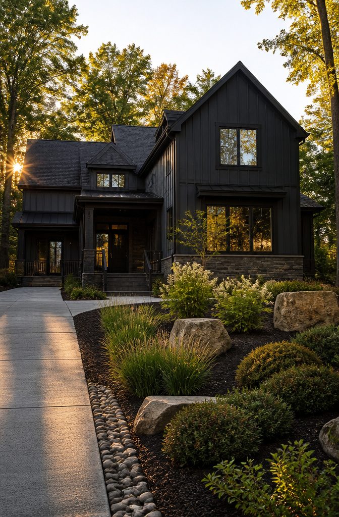
Black Fox and its near-black cousins, including Inkwell and Regent Green, read as confident from the curb. The drama works best when something lighter balances it: warm wood trim, natural stone, or strong landscaping keeps the weight from going flat.
The maintenance reality is what stops most people. Dust, pollen, and water spots show immediately on a dark surface, and the sheen of fresh paint makes every overlap visible during touch-up.
Plan on full-panel repainting rather than spot fixes, because the edge where new meets old catches light differently on these saturated bases.
Deep navy avoids the funeral-home association pure black carries, and charcoal with a blue undertone, like Inkwell, shifts with the daylight in a way that reads intentional rather than severe.
Regent Green goes so dark it registers as black until you stand close, which gives the same presence with slightly less heat absorption.
For a first project on a weekend budget, the striking look is achievable; keeping it striking past the first season is where the real cost lives.
9. Soft Pastels
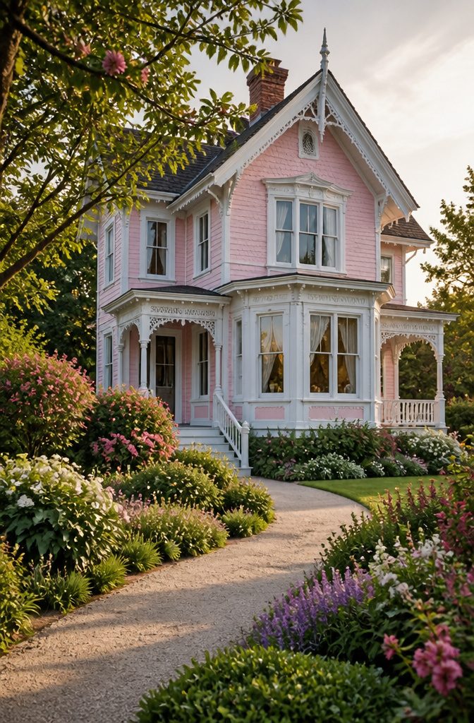
Soft pastels sit in the tricky space between charming and childish, and the difference usually comes down to undertone.
A powder-pink like Masquerade reads elegant against greenery because it carries enough warmth to stay grounded; shift a degree cooler and the same value turns saccharine on a Victorian wraparound porch.
Light blues such as Celestial Blue dodge the problem more consistently, pairing with Loft White on trim for a coastal scheme that ages better than trendy.
The architectural match matters.
Pastels suit homes with detail to spare: gingerbread trim, divided-light windows, clapboard shadow lines that break up the color field. Slap the same value on a flat-faced ranch and the effect thins out fast.
Climate plays against the romance. Lighter colors reflect heat, which helps in warm regions, but pastels show dirt and mildew sooner than mid-tones.
A blue-gray that reads serene in overcast coastal light can shift distinctly pink at golden hour or pull green under heavy tree cover.
Get a physical sample and watch it across a full day before the painters arrive; what holds steady at 10 a.m. may surprise you by 6.
How to Test Paint Before Committing
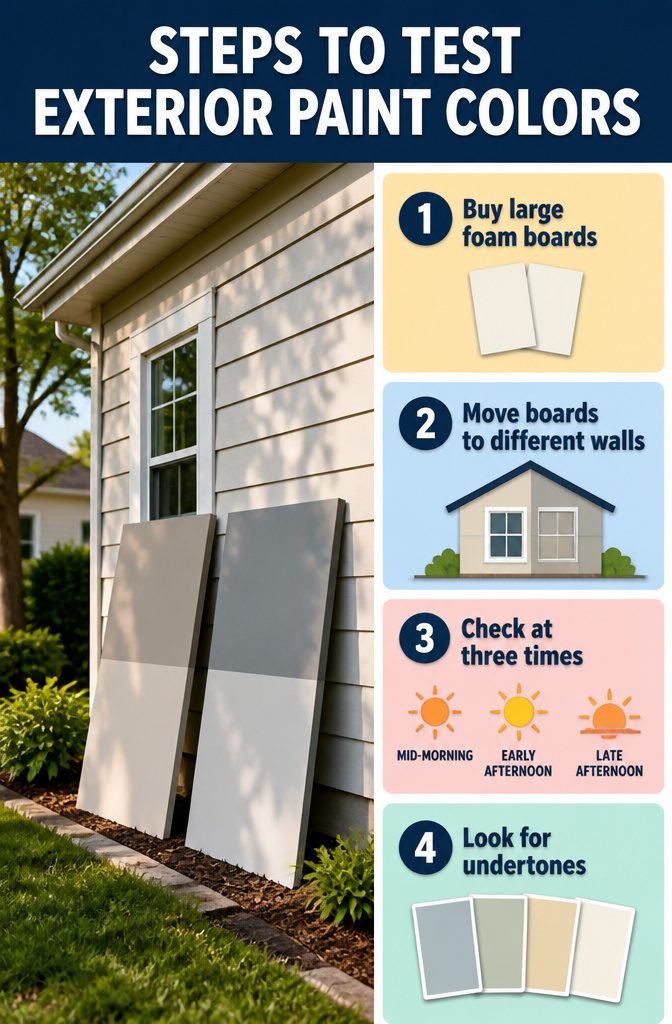
Paint chips under fluorescent store lights lie. The greige that looks sophisticated indoors can read purple in morning sun, then shift again by late afternoon.
- Buy two large foam boards, about 20 by 30 inches, and paint each sample with two full coats. Small swatches or hand-sized stickers hide the real behavior of the color at scale.
- Move the boards to different walls. Morning light on the east face hits cooler and harder; the same color on a north wall under tree shade turns noticeably darker. The direction your home faces changes what you see.
- Check them three times: mid-morning, early afternoon, and late afternoon. I once had a sample that looked clean and warm at 10 AM, then turned flat and muddy by 5 PM as the light warmed. That board saved me from painting the whole house a color I would have hated by dinnertime.
- Look at undertones in each condition. A gray that reads blue at noon might flash green in overcast light, or a warm white can go yellow where roof overhangs cast shadow.
If a sample fails at any hour, the full job will fail too. Two boards and a day of walking outside beats discovering the problem after the first coat is dry.
Working With Your Fixed Elements
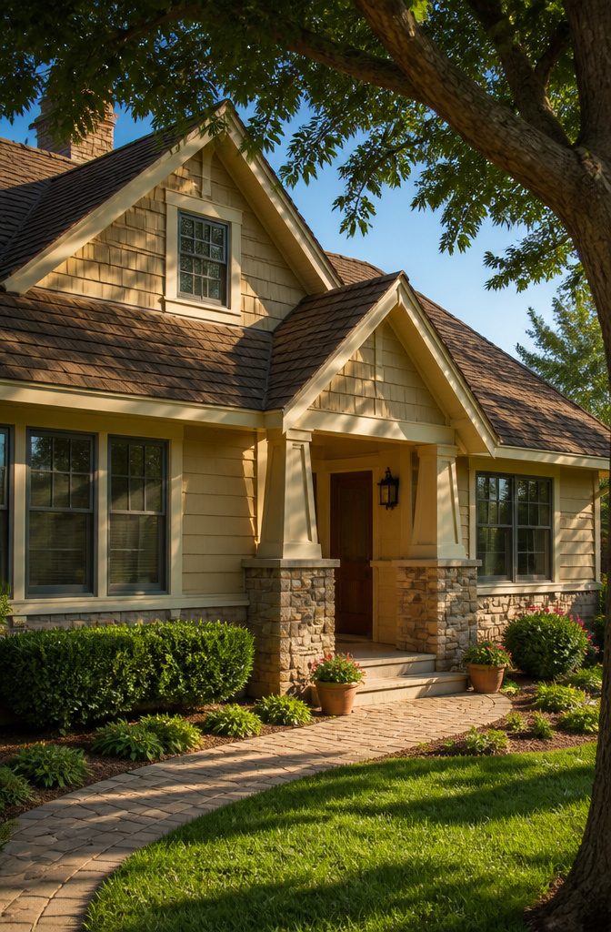
The roof takes up more visual space than most people realize, and its color temperature sets the rules for everything below it.
A warm brown shingle wants siding with yellow or red undertones, not a cool gray that makes the whole house look like two projects collided.
The same discipline applies to stone accents and brickwork. Those flecks of gray running through your foundation stone are not decoration; they are a built-in palette you either match on purpose or fight by accident.
Start by looking at your fixed materials in direct sun, then again in shade.
The undertones shift, and paint will shift right along with them. A gray that reads neutral at noon can pull green under cloud cover.
Hold a paint chip against the actual stone or roof shingle, not a photo. Photos lie about color temperature.
If your brick has a strong cast, you have two ways to play it.
Draw out the undertone with a closely related siding color for a quiet, unified look, or step deliberately in the opposite direction with contrast that frames the masonry instead of blending into it. Either choice works.
What fails is the middle ground, where the siding is close enough to clash but not enough to harmonize. That indecision reads as a mistake from the curb, and it is the one you cannot fix later without starting over.
Accent Colors That Actually Work
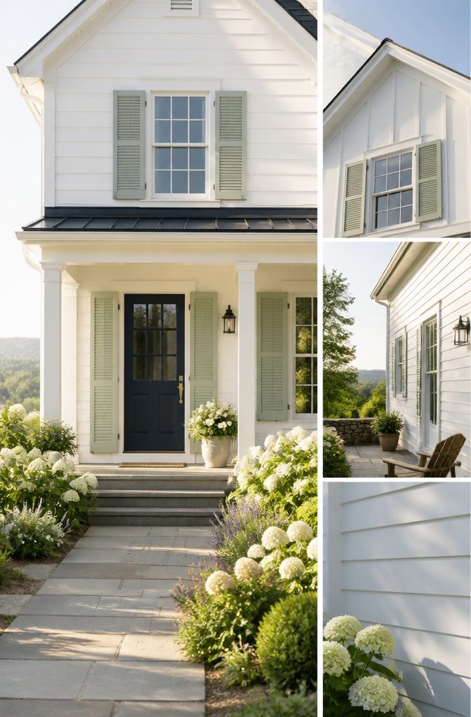
A single accent color, used with discipline, draws the eye to the door or the shutters without turning the facade into a bulletin board.
The rule of thumb that has kept me out of trouble since a 2019 misstep runs roughly 60 percent body, 30 percent trim, 10 percent accent. That ratio leaves the accent visible but not shouting.
The mistake I made on a rental I was helping paint was splitting that 10 percent three ways: navy on the door, rust on the shutters, black on the railings.
From the curb it read as indecision, not intention. One accent color, maybe two if the architecture clearly separates them, is the ceiling for most houses.
Benjamin Moore’s pairings show the restraint in practice. Revere Pewter HC-172 on the body, Swiss Coffee OC-45 on trim, and a single shot of Copley Gray HC-104 as accent keeps the whole thing quiet.
Louisburg Green HC-113 with Castle Peak Gray 1561 on the door and Halo OC-46 as the light accent works the same way: one green family, one controlled contrast.
For coastal or farmhouse palettes, the same math holds. Navy blue and white, like Little Greene’s Hicks’ Blue against Loft White, succeeds because the navy is doing all the accent work alone.
The modern farmhouse look, with its soft whites and sage greens, leans on earthy greens or classic blues for shutters and doors, never both on the same elevation.
What Is Trending and What Lasts
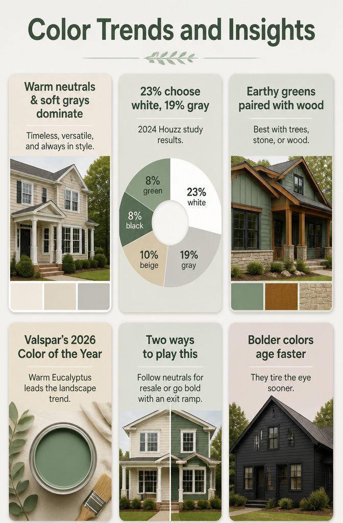
Warm neutrals, creamy whites, and soft grays still dominate the 2026 color conversation for good reason.
They read as classic on a colonial in Maryland or a bungalow in Portland, and they photograph cleanly when you list the place eight years later.
Sage and olive are climbing fast, with designers swapping deep brown-greens like Sherwin-Williams Muddled Basil in where black used to live. The move buys drama without the maintenance headache of true black siding in a hot climate.
The tension sits right there.
A 2024 Houzz study put white at 23% of exterior choices, gray at 19%, beige at 10%, with black and green tied at 8% each. Those numbers track what I watch on my own street: the bolder houses age faster in the eye.
Valspar’s 2026 Color of the Year, Warm Eucalyptus, nods to the landscape trend, but earthy greens and bronzy browns work best where the lot already carries trees, stone, or wood. On a bare suburban corner they can look like a costume.
Two ways to play this: follow the warm neutral wave and lock in resale safety, or commit the body to a saturated earth tone and keep the trim white for an exit ramp if tastes shift.
The second route costs more at repaint, but the first risks looking like every third house on the block.
Frequently Asked Questions
What is the most popular color for a house exterior?
White leads at 23% of exterior renovations, followed by gray at 19% and beige at 10%. Light neutrals stay on top because they reflect heat, make houses look larger, and pair easily with almost any trim or door color.
What exterior house colors are trending?
Earthy greens like olive and sage are climbing fast, with warm neutrals and creamy whites still dominating.
Designers are also swapping deep brown-greens such as Sherwin-Williams Muddled Basil in where black used to sit, buying drama without the maintenance headache of true black in hot climates.
How do you choose exterior paint colors for your house?
Start with your fixed elements: roof, brick, and stone carry undertones that set the rules for everything below them.
Test colors against the actual materials in both sun and shade, and let samples sit for two full days of light before deciding.
Should you sample exterior paint colors before choosing one?
Yes.
Buy two 20-by-30-inch foam boards, paint them with two coats, and move them to different walls. Check at mid-morning, early afternoon, and late afternoon; a color that looks clean at 10 a.m. can turn muddy by 5 p.m.
What are the best green exterior house colors?
Olive, sage, and deeper greens that read almost brown in late light work best.
Benjamin Moore Mohegan Sage carries enough gray to settle against wood and stone, while Regent Green goes darker and richer. Paint at least a 3–4 foot square and watch it across a full day before committing.
What exterior color makes a house look expensive?
Deep navy and charcoal read as intentional and high-end when paired with lighter trim or natural materials like wood and stone.
Contrast does the work: without it, moody body colors flatten into a single dark plane that looks heavy rather than refined.
What color is replacing grey in 2026?
Warm neutrals and earthy greens are moving in where cool gray dominated.
Valspar’s 2026 Color of the Year, Warm Eucalyptus, nods to the trend, and designers are using deep brown-greens like Muddled Basil as a substitute for black siding. Gray itself is not disappearing, but its cool variants are aging faster than expected.
What are the most popular exterior house colors in 2026?
White (23%), gray (19%), and beige (10%) still lead, with black and green tied at 8% each. Warm neutrals, creamy whites, and soft grays dominate for resale safety, while sage and olive are the fastest climbers among bolder choices.